Have you ever built a house?
One of the best parts of building a house is going in to the fancy showroom and picking your tiles, taps and bathtub! Building a website is surprisingly similar; there are a bunch of things that need to be chosen (or communicated to the ‘builder’) before you get started.
We’ve made this process as easy as possible by putting together a Prestart Checklist for our customers.
1. Logo
This one should be pretty obvious already! Hopefully it’s not a surprise to you that you’ll need a logo, and you’ve already got one handy. There are a few things that we need you to check before we get started though…
Resolution & file types
The absolute best version of your logo you can provide us is in a vector format, such as SVG, EPS or AI. If you’ve had your logo designed by a professional, they likely provided you these files but you might not be able to open them without fancy software. Don’t stress – we have that software and they’re exactly what we need!
If you designed it yourself in a program like Canva and you still have the original, let us know – we might be able to extract it from there as a vector file also.
If you only have a standard image file type (e.g. JPG or PNG) then the rule of thumb here is that bigger is better! The higher the resolution (number of pixels, how we measure size on a computer screen) the more useful it will be. Having said that, if you don’t have a vector version of your logo we would still recommend that you consider getting one made – this is very affordable using services such as Fiverr.
Transparency & background
To give us the most options, we ideally need your logo to be on a transparent background. If you’ve provided us a vector file that’s awesome – you don’t need to do anything else! If not, we may need to check what versions you have (and specifically, whether any are a .png file with a transparent background). You should easily be able to test this by placing your logo on top of a coloured background. Is there a white box around it? If not, perfect!
That brings us to background, actually… we generally recommend that you have multiple versions of your logo available for use in different scenarios (such as on a light vs. dark background). If you have this, please provide us with the full range of assets – and if you don’t, it might be worth considering!
Orientation
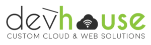
Did you know that we have five versions of our logo? See if you can spot them all on this page!
You’ll notice that the one we use in our header doesn’t have a tagline, to take up less space than our standard logo. Other versions, such as our ‘stacked’ logo, are used on things like business cards or cool company swag (just kidding, we don’t have House Digital oodies… yet!)
Consider how your logo is going to work on a website, and whether it is going to limit your design options. For example, a very tall logo will require a lot of space at the top of the page, or may end up being too small to read in a traditional header. Avoid poor user experience by having the right tools for the job!
2. Elevator Pitch
Want to know why it’s called an elevator pitch?
Because you need to explain what you do in the time it takes for the elevator to reach the ground floor, and make sure the human who’s trapped in there with you wants to know more by the time the doors open. If you can’t do that, spend some time refining your unique value proposition and messaging to communicate who you are, what you do, who you help and how you do it. If you’re struggling, consider booking a workshop to nut it out together!
3. Colour Palette
Specifically, an accessible one. What that means is that your colour combinations are going to provide a good user experience for everyone, including those with poor contrast recognition (like our founder, Jo) or colour blindness (like our front-end dev, Lovely). Accessibility is for everyone though, not just those with disabilities; and following best practices means everyone will have a better experience (yourself included). Here are some of our favourite tools for checking colour palettes for accessibility:
WebAIM Colour Contrast Checker
Adobe Colour Blindness Checker
At a minimum, we recommend having the following colours in your palette:
- One dark colour and one light colour (e.g. background and foreground) that have a contrast ratio of at least 7:1.
- One accent colour that has a contrast ratio of at least 4.5:1 with either your light or dark colour.
Of course, if you have more than that – great! We certainly do 😂
4. Typography
STOP! Before you go any further, please read this article by our head honcho, Jo.
Alright, have you read it? Good, we can continue!
Body Text Font
This is the font that will be used for the majority of your paragraph text. It should be easy to read, and ideally either part of the Google Fonts collection (preferred) or Adobe Fonts collection (if you must). This is primarily because anything else has the potential to really slow down your website, and ain’t NOBODY got time for that.
Accent / Heading Font
This one is optional, but it is common to have one to two accent fonts that are used for things like headings or call-to-actions (e.g. buttons). These should complement your main font, and while they can be a bit fancier, they shouldn’t be excessively hard to read. A font that looks great in a logo doesn’t necessarily work for a website heading! We love using this tool to see how headings and body text fonts might look together.
5. Imagery
We all know the old saying – a picture tells a thousand words. We recommend having around ten or so images ready to provide to us that represent your brand ‘voice’ and are fairly consistent in style. These could be illustrations, photos, or a combination of both.


Visual Elements (Optional)
In addition to photos or illustrations, you may also want to share any visual elements that you regularly use as part of your brand, or that you would like to incorporate. For example:
- Icons
- Infographic elements
- Fun confetti you use on Insta posts
- Cool particle effect you really like on this website
- Random blobs and floating bubbles
6. Your Crushes
OK, we actually want both your crushes AND your burn book. The designs you love, and the ones that make you want to throw a shoe at the screen. Have some examples ready of anything you really do or don’t like, and ask yourself the all important question: Why?
Once you’ve got all these things ready to go you are well on your way to your brand new website. If you need help navigating some of these, we run 2 hour, 4 hour and full-day workshops that cover this sort of thing and so much more!
Downloadable PDF
Want an old-school, off-line, printable copy you can work through yourself? Download our one-page PDF below.